


It is a project that I have been wanting to work on for a few years now.
I am printing pictures that I have taken all around the world over the last few years.
Including Alaska, Nevada, La Jolla, Monterey, Ireland, and around the Baltic Sea.
I am really excited about it.
My photo skills are very amateur, and actually a lot of the pictures that I'm printing are from my point and shoot camera.
Most of the shots I have already selected and edited.
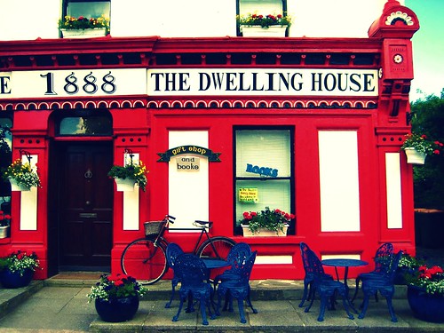
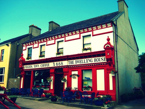
But these pictures, taken on Valentia Island - which is along the Ring of Kerry in Ireland have me torn. I want to print one of them, but can't decide.
I love the all of the detail in the first shot. But it kinda bugs me how much of the building is cropped out.
The second shot shows the character of the building itself, but you lose some of the up close detail.
Help a sister out, and let me know which one you would pick to print and hang among a wall of photos from around the world.
Up Close:
Farther Away:
Thanks! And stay tuned for more posts about some of my older travels, and the picture hanging project!
Gosh, I like them both! But I think I'm going to pick picture #1.. up close.
ReplyDeleteThose are awesome!
I'm with Heather. Up close. Love the red.
ReplyDeleteup close. fo' sho'
ReplyDeleteI love the first one. Is there a way to crop it further so that it looks like you didn't get the whole building by choice?
ReplyDeletelove the up close one. So pretty!
ReplyDeleteThe first is a bit awkward because of the crop. Personally, I would go with the second one. Both are beautiful, we know. Ow that if I had the weird crop on my wall, it would always bug me. :-)
ReplyDeleteI love both, but I would frame the first one.
ReplyDeleteHi Kim! I'd go with the second one. I'm so OCD that the first one would bug me too, but the second one still conveys the blue pops of color with the outside seating, but the red is still there. I also love the texture and shading to the typically-considered-boring side of the building. I think there might be more in the second photo upon closer inspection that would please the eye. Just my amateur opinion though. I can't wait to see which one you choose!
ReplyDeletesecond! more color!
ReplyDeleteI like the up close one!
ReplyDeleteThe first one for sure.
ReplyDeletedefinitely the first one
ReplyDeleteIf it were me I'd choose the first,
ReplyDeleteand would crop out the little bit of empty space on the right side of the photo and have the red building fill the whole picture.
Love that red!
~Keri
I don't think you could go wrong with either! They're both fun pictures!
ReplyDelete(wasn't that helpful?!? :))
First one! It's way more interesting and artsy.
ReplyDeletei love them both but when i was deciding i kept coming back to the 2nd picture. i love the contrast of the blue sky with the red on the building. in love with red/blue!
ReplyDeleteI like the look of the second one best!
ReplyDeleteLooks who's getting artsy now!! :)
ReplyDeleteI for sure like the first one, but it depends on the other photos... are they all holistic like the second of your shots here or is there a mix?